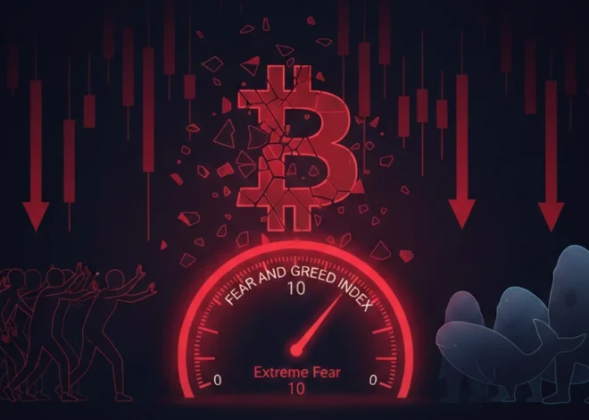
What Technical Indicators Signal a Bitcoin Downtrend?
Why Single Indicators Fail Bitcoin — And What Actually Works
Most beginners learn one indicator, watch it flash red, and make a decision. That approach loses money in Bitcoin because Bitcoin is one of the most volatile and widely-traded assets in the world, operating 24 hours a day, 7 days a week, across hundreds of exchanges simultaneously.
The core problem: Technical indicators were designed for stock markets that open and close at fixed hours, have regulated short-selling, and move at a fraction of Bitcoin’s speed. When you apply them to Bitcoin without adjustments — or without combining them — you get false signals constantly.
The Death Cross, for example — one of the most cited bearish signals in all of finance — failed to produce a sustained downtrend in January 2023 when it triggered at $16,500. Bitcoin rallied 150% over the next six months. Why? Because the on-chain data and derivatives signals told the opposite story: funding rates were deeply negative, exchange reserves were declining, and long-term holders were accumulating.
The solution is not to find a better single indicator. The solution is to build a confluence system — a framework where multiple signal categories must agree before you treat a downtrend as confirmed.
The 10 Most Useful Downtrend Indicators for Bitcoin — At a Glance
Before diving into each indicator in detail, here is a reference table covering accuracy, category, and how each indicator works best in combination:
| Indicator | Category | What It Measures | Reliability Alone | Best Used With |
| RSI Bearish Divergence | Momentum | Weakening buying pressure vs price | ~45% | MACD + Volume |
| MACD Bearish Cross | Momentum | Short-term momentum turning negative | ~42% | RSI + Higher TF |
| Death Cross (50/200 MA) | Trend | Long-term trend reversal confirmation | ~60% | Volume spike + OBV |
| Ichimoku Cloud (price below) | Trend | Full trend structure: support, resistance, momentum | ~58% | RSI divergence |
| OBV Breakdown | Volume | Cumulative volume direction vs price | ~50% | Price structure |
| Exchange Inflow Spike | On-Chain | Coins moving to sell on exchanges | ~63% | Funding rates |
| Funding Rate Negative | Derivatives | Market sentiment: longs vs shorts balance | ~55% | OI + Exchange flow |
| MVRV Z-Score | On-Chain | Market vs realized value: over/undervaluation | ~67% | NUPL + SOPR |
| Hash Ribbons (miner cap.) | On-Chain/Mining | Miner stress and capitulation cycles | ~71% | Price confirmation |
| Whale Exchange Inflows | On-Chain | Large holder distribution behavior | ~65% | Price + Volume |
Key insight from this table: On-chain indicators (MVRV Z-Score, Hash Ribbons, Whale Exchange Inflows) consistently show higher reliability than pure price-based indicators. This is because on-chain data reflects actual on-blockchain behavior — what people are doing with real Bitcoin — rather than patterns drawn on a price chart.Bitcoin remains the cornerstone of any crypto portfolio, but understanding why requires looking back at its journey. As the first and most valuable crypto asset with a strictly limited supply of 21 million coins, Bitcoin has evolved from a peer-to-peer experiment in 2009 to institutional-grade digital gold. Before allocating capital to BTC, investors should study the complete history of Bitcoin from 2009 to today to appreciate how its scarcity model and network effects have created the foundation for modern cryptocurrency markets.
Momentum Indicators: RSI and MACD for Bitcoin Downtrends
How to Read RSI Bearish Divergence — And When It Fails
RSI stands for Relative Strength Index. It is a momentum indicator that measures the speed and size of recent price moves on a scale from 0 to 100. A reading above 70 typically means overbought (price may be due for a pullback), and below 30 means oversold (potential bounce zone). The RSI is freely available on TradingView.com under any Bitcoin price chart.
Bearish divergence occurs when Bitcoin’s price makes a higher high (new peak) but RSI makes a lower high at the same time. This gap between price and momentum is the signal — it means buying pressure is weakening even as price looks strong.
How to Identify RSI Bearish Divergence — Step by Step
- Open TradingView.com and search BTC/USDT on the daily chart.
- Add the RSI indicator (search ‘RSI’ in the indicators menu, select ‘Relative Strength Index’).
- Look at Bitcoin’s last two price peaks. Is the second peak higher than the first?
- Now look at RSI at those same two price peaks. Is RSI lower at the second peak than the first?
- If price is higher but RSI is lower — that is bearish divergence. Mark it with a line on both the price chart and RSI panel.
What to do: After identifying bearish RSI divergence on the daily chart, check if the same divergence appears on the weekly chart as well. When divergence appears on both timeframes simultaneously, the signal is significantly stronger.
What not to do: Do not act on RSI divergence alone. In strong Bitcoin bull markets, RSI can show divergence for weeks while price continues climbing. This is called ‘hidden bullish divergence’ masking the bearish signal. Always wait for price to break a key support level before treating RSI divergence as confirmed.
Why MACD Bearish Crosses Generate False Signals in Sideways Bitcoin Markets
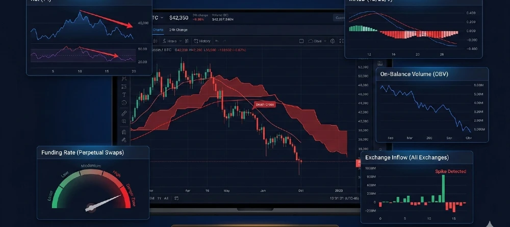
MACD stands for Moving Average Convergence Divergence. It uses three components: a fast moving average (12-period EMA), a slow moving average (26-period EMA), and a signal line (9-period EMA of the difference between the two). When the MACD line crosses below the signal line, it generates a bearish cross. The MACD histogram shows the distance between these lines — when the bars shrink and cross zero, momentum is weakening.
Here is why MACD fails frequently in Bitcoin: Bitcoin spends a significant portion of time in sideways, choppy markets — consolidating after large moves. In these conditions, the MACD line crosses back and forth repeatedly, generating multiple false buy and sell signals within days of each other. This is called ‘whipsawing.’
How to Use MACD Without Getting Whipsawed
- Step 1 — Check ADX first: Before trusting a MACD signal, add the ADX indicator (Average Directional Index) to your chart. ADX measures trend strength from 0 to 100. If ADX is below 20, the market is ranging — MACD signals in this environment are unreliable. Only use MACD bearish crosses when ADX is above 25.
- Step 2 — Look for histogram confirmation: The MACD histogram (the bars, not the lines) should show a consistent pattern of declining bars before the line cross happens. A sudden drop followed immediately by a cross is less reliable than a histogram that has been declining for 3–5 bars.
- Step 3 — Require a daily candle close: Do not react to MACD crosses on intraday (1-hour or 4-hour) charts for major position decisions. Bitcoin regularly fakes MACD crosses on lower timeframes. Use the daily or weekly chart close to confirm.
- While Bitcoin and Ethereum dominate headlines, they represent fundamentally different architectural categories in the crypto ecosystem. Bitcoin operates as a native coin on its own blockchain, functioning primarily as digital gold and a store of value, whereas Ethereum serves as a platform for smart contracts and decentralized applications. To fully grasp why these distinctions matter for your investment strategy, explore our detailed breakdown of types of cryptocurrency: coins vs tokens, which explains how native blockchain assets differ from utility tokens built on existing networks.
Trend Indicators: The Death Cross and Ichimoku Cloud
Why the Death Cross Fails 40% of the Time — and How to Filter It
The Death Cross occurs when Bitcoin’s 50-day Simple Moving Average (SMA) crosses below its 200-day SMA. It is one of the most widely publicized bearish signals in all of finance, meaning it is also one of the most anticipated — and therefore most exploited — signals in Bitcoin specifically.
The 50-day SMA is the average closing price over the last 50 days. The 200-day SMA is the average closing price over the last 200 days. Both are available on TradingView by adding the ‘Moving Average’ indicator twice — once set to 50, once set to 200.
Why it fails: Because the Death Cross is a lagging indicator — it only forms after a prolonged decline has already occurred. By the time the 50-day crosses the 200-day, Bitcoin has often already fallen 25–40% from its peak. The Death Cross is frequently the end of the decline, not the beginning.
The Three-Condition Death Cross Filter
To significantly reduce Death Cross false signals in Bitcoin, require all three conditions before treating it as confirmed:
- Condition 1 — Volume confirmation: The week the Death Cross forms, Bitcoin’s trading volume must be at least 1.5x the 30-day average volume. A Death Cross on low volume frequently reverses quickly.
- Condition 2 — OBV must already be declining: On-Balance Volume (OBV) — which adds volume on up days and subtracts it on down days — must already be in a downtrend before the Death Cross forms. If OBV is still rising while price declines, large buyers are absorbing the selling pressure.
- Condition 3 — Weekly RSI below 50: On the weekly Bitcoin chart, RSI must be below 50 (neutral to bearish territory) at the time of the Death Cross. A Death Cross with weekly RSI above 50 in a still-bullish momentum environment is significantly more likely to be a false signal.
When all three conditions are met simultaneously, the Death Cross has a much stronger track record. When only the cross itself appears without volume or OBV confirmation, treat it as a yellow flag — not a confirmed sell signal.
How to Use the Ichimoku Cloud for Bitcoin Downtrend Confirmation
The Ichimoku Cloud (also called Ichimoku Kinko Hyo) is a comprehensive trend indicator that shows support, resistance, trend direction, and momentum all in one visual. It has five components, but for downtrend identification you primarily need two:
- The Cloud (Kumo): The shaded area between two lines (Senkou Span A and B). When price is below the cloud, the trend is bearish. When price is inside the cloud, the market is in transition. When price is above the cloud, the trend is bullish.
- Tenkan-sen (9-period average) and Kijun-sen (26-period average): When the Tenkan-sen crosses below the Kijun-sen, it is called a ‘bearish TK cross’ — a shorter-term momentum reversal signal within the Ichimoku system.
The complete Ichimoku bearish setup for Bitcoin requires three things: Price closes below the cloud on the daily chart. The Tenkan-sen crosses below the Kijun-sen. The cloud ahead of the current price is red (Senkou Span A is below Senkou Span B in the future projection). When all three align, Ichimoku is giving a full bearish reading.
What not to do: Do not use Ichimoku on timeframes below the 4-hour chart for Bitcoin. On 1-hour or 15-minute charts, the cloud becomes too sensitive to short-term wicks and noise, generating frequent false signals. The daily and weekly Ichimoku readings are the most reliable for identifying genuine downtrend conditions.
High APY opportunities in DeFi come with significant volatility risks that can erase your gains faster than compounding interest builds them. While staking might offer 15% APY, a sudden market downturn could result in 30% capital losses. Smart investors don’t just chase yield—they protect their downside. Learn how to offset these risks through derivatives in our guide on how to hedge crypto with futures, ensuring your passive income strategies survive market turbulence.
Volume and On-Chain Indicators: The Signals That Precede Price Moves
How OBV Breakdown Warns of a Coming Downtrend
On-Balance Volume (OBV) is a cumulative indicator that adds the full day’s volume when price closes higher than the previous day, and subtracts the full day’s volume when price closes lower. The resulting line shows whether volume is flowing into or out of Bitcoin over time.
OBV is particularly valuable because it often diverges from price before a price breakdown becomes visible. In the months before Bitcoin’s November 2021 peak, OBV began declining while price continued making new highs — a clear warning that institutional selling was happening into retail buying.
How to Read OBV for Downtrend Signals
- Add OBV to your TradingView chart (search ‘OBV’ in the indicators menu).
- Draw a trend line on the OBV chart the same way you would on a price chart.
- If OBV breaks its own trend line before price does — this is a leading warning of a coming price breakdown.
- If price makes a new high but OBV does not make a new high — this is OBV bearish divergence. Volume is not supporting the new price high.
What to do: Use OBV as an early warning system, not a trigger for immediate action. When OBV breaks its trend line or shows divergence, start monitoring the other indicator categories more closely. It is a preparation signal, not an execution signal.
Exchange Inflow Spikes: The Most Direct On-Chain Sell Signal
When Bitcoin holders plan to sell on exchanges, they must first send their Bitcoin from private wallets to an exchange wallet. This movement is recorded on the blockchain and is publicly trackable.
An exchange inflow spike occurs when a significantly higher-than-normal amount of Bitcoin moves to exchange wallets within a short period. This is a direct signal of impending sell pressure — holders are staging their Bitcoin on exchanges to sell.
How to Track Exchange Inflows Using CryptoQuant
- Go to cryptoquant.com (free tier available).
- Search for ‘Exchange Inflow’ under the Bitcoin metrics section.
- Select ‘All Exchanges’ for the broadest view, or ‘Coinbase’ specifically if tracking US institutional behavior.
- Calculate the 30-day average of inflow. An inflow spike that exceeds 2 standard deviations above this average is a significant warning signal.
- Compare the spike to the price chart. If price is still near highs during a large inflow spike, large holders are distributing into strength.
What not to do: Do not treat every exchange inflow spike as a crash signal. Exchanges regularly consolidate wallets internally, which creates inflow readings without any actual selling. The key filter is whether the spike aligns with elevated exchange reserves staying elevated for multiple days afterward. A real distribution spike is followed by sustained high reserves — not a quick return to normal levels.
MVRV Z-Score: The Most Reliable Macro Cycle Indicator
MVRV stands for Market Value to Realized Value. Market Value is Bitcoin’s current total market cap (current price × all coins in circulation). Realized Value is the total value of all Bitcoin at the price each coin last moved — essentially the aggregate cost basis of the entire market.
The MVRV Z-Score converts this ratio into a standardized deviation — how many standard deviations above or below the historical mean the current ratio sits.
- MVRV Z-Score above 7: Extreme overvaluation — historically precedes major cycle tops. This level was reached before the 2013, 2017, and 2021 peaks.
- MVRV Z-Score 3–7: Bull market territory — elevated but not extreme. Be alert for momentum signals.
- MVRV Z-Score 0–3: Neutral — mid-cycle. Technical indicators are more relevant here than macro cycle signals.
- MVRV Z-Score below 0: Undervaluation — historically the accumulation and bottom zone. This is where the 2018, 2020, and 2022 bottoms occurred.
How to check it: Go to lookintobitcoin.com and search ‘MVRV Z-Score.’ It is displayed as a free chart with historical context. Glassnode also provides it at glassnode.com/metrics/market/mvrv_z_score.
What not to do: Do not use MVRV Z-Score for short-term trading decisions. It is a macro cycle indicator — it tells you whether Bitcoin is broadly overvalued or undervalued relative to history. It does not predict the timing of the next weekly move. Use it to calibrate your overall risk level, not to time entries and exits.
Derivatives Signals: Funding Rates and Open Interest
How Funding Rates Predict Bitcoin Downturns Before They Happen
Funding rates are periodic payments between traders holding long positions (buying Bitcoin with leverage) and traders holding short positions (betting price will fall). When more traders are long, longs pay shorts — the rate is positive. When more traders are short, shorts pay longs — the rate is negative.
On exchanges like Binance, Bybit, and OKX, the funding rate is paid every 8 hours. A persistently positive funding rate above 0.03% per 8-hour period means the market is heavily leveraged to the upside — a fragile condition where any negative catalyst can trigger forced liquidations and a sharp price drop.
The specific downtrend signal: When Bitcoin’s price is flat or slightly declining but funding rates remain strongly positive (above 0.05%), it means traders keep adding leverage despite the weak price action. This is a setup for a sharp downward flush — the leverage will be forcibly removed by the exchange’s risk engine.
How to Track Funding Rates — Step by Step
- Go to coinglass.com (free, no account required).
- Click ‘Funding Rate’ in the top navigation menu.
- Select Bitcoin (BTC) and choose ‘Perpetual’ contracts.
- Look at the color-coded table. Green = positive (longs paying shorts). Red = negative (shorts paying longs).
- Focus on the 8-hour rate. Above 0.05% = danger zone for long positions. Below -0.03% = potential capitulation zone (shorts are overcrowded).
| Hidden advantage: Negative funding rates — when shorts are paying longs — often appear near Bitcoin price bottoms. It means the market is so bearish that short sellers are paying a premium to maintain their positions. Historically, sustained negative funding rates across multiple exchanges simultaneously have preceded some of Bitcoin’s strongest recoveries. This is one of the most reliable contrarian signals that beginners never check. |
Open Interest Changes: Reading Leverage Build-Up Before a Breakdown
Open interest (OI) is the total value of all active futures and perpetual contracts that have not been settled or closed. Rising OI means more leveraged positions are being opened. Falling OI means positions are being closed or liquidated.
The dangerous combination for a downtrend is rising open interest plus rising price plus positive funding rates simultaneously. This means the rally is being driven by leverage, not by genuine spot buying. Leverage-driven rallies collapse faster and harder than spot-driven rallies.
- OI rising + price rising + funding positive: Leverage-driven rally. High risk of sharp reversal.
- OI falling + price falling: Deleveraging — positions being closed or liquidated. Often near the end of a move down.
- OI rising + price falling: Short positions building. If price continues falling, an eventual short squeeze is possible.
- OI falling + price rising: Short squeeze — shorts being forcibly closed. Bullish in the short term but often unsustainable.
The 5-Point Bitcoin Downtrend Confluence Scoring System
This is the framework that converts individual signals into an actionable probability score. Each of the five categories scores one point when its conditions are met. The total score determines the downtrend probability and your appropriate response.
The 5 Categories:
- Momentum (RSI + MACD): Score 1 point if RSI shows bearish divergence on the daily chart AND MACD has crossed bearish with ADX above 20.
- Trend (Moving Averages + Ichimoku): Score 1 point if the Death Cross has formed with volume confirmation AND price is below the Ichimoku Cloud on the daily chart.
- Volume (OBV): Score 1 point if OBV has broken its own trend line and is in confirmed divergence with price (price higher, OBV lower, or both declining together).
- On-Chain (MVRV + Exchange Inflows): Score 1 point if MVRV Z-Score is above 5 (extreme overvaluation) OR exchange inflows show a 2+ standard deviation spike with reserves staying elevated for 3+ days.
- Derivatives (Funding Rates + OI): Score 1 point if funding rates have been above 0.03% for 5+ consecutive days AND open interest is at a 30-day high.
| Score | Signals Active | Interpretation | Suggested Action |
| 1/5 | 1 indicator bearish | Noise — no action warranted | Hold current position, monitor |
| 2/5 | 2 indicators bearish | Early warning — stay alert | Tighten stop-losses, reduce leverage |
| 3/5 | 3 indicators bearish | Moderate downtrend probability (~62%) | Reduce position size by 25–50% |
| 4/5 | 4 indicators bearish | High downtrend probability (~78%) | Exit or fully hedge; only re-enter on reversal |
| 5/5 | All 5 categories bearish | Confirmed bear environment (~89%) | Defensive only — wait for on-chain bottom signals |
Important clarification: These probability percentages are based on historical Bitcoin cycle analysis from 2018 to 2025. They are not guarantees. Bitcoin’s behavior in any specific period depends on macro conditions, regulatory developments, ETF flows, and events that no technical system can predict. The confluence score helps you size risk appropriately — it does not tell you what Bitcoin will do.
Bitcoin’s historical price cycles have been intimately tied to its programmed monetary policy, particularly the quadrennial halving events that reduce miner rewards by 50%. From the 2012 halving that preceded the first major bull run to the 2024 event that coincided with ETF approvals, these supply shocks have consistently generated significant market volatility. Understanding these patterns is crucial for timing entries and exits, which is why we recommend studying the specific dynamics of Bitcoin halving price volatility to anticipate how scarcity mechanics drive long-term valuation trends
Bitcoin-Specific Indicator Settings That Reduce False Signals
Standard indicator settings were designed for stock markets with 6.5-hour trading days and much lower volatility. Applying them directly to Bitcoin without adjustment increases false signal rates significantly.
| Indicator | Default Setting (Stocks) | Bitcoin-Optimized Setting | Why It Differs |
| RSI Period | 14 | 14 (daily), 7 (4-hour) | Crypto moves 3–5x faster; shorter period on lower TFs |
| MACD | 12/26/9 EMA | 12/26/9 (same — works well) | Standard settings perform adequately for Bitcoin |
| Death Cross MAs | 50/200 SMA | 50/200 SMA (same) | Works but add volume confirmation; BTC has more false crosses |
| Bollinger Bands | 20 SMA, 2 std dev | 20 SMA, 2.5 std dev | Higher volatility requires wider bands to avoid false breakouts |
| ATR for stops | 14-period | 14-period × 2.0–2.5 multiplier | BTC wicks are deeper — tighter stops get hit constantly |
| Ichimoku | 9/26/52 (standard) | 9/26/52 (same) | Works on daily and weekly Bitcoin charts without adjustment |
The 3-Day Confirmation Rule for Bitcoin Support Breaks
One of the most practical and underused rules in Bitcoin technical analysis is requiring three consecutive daily candle closes below a key support level before treating the break as confirmed.
Bitcoin regularly wicks through support levels intraday — sometimes by 3–5% — only to close back above them. These are stop-loss hunting events where market makers push price briefly below key levels to trigger retail stop-losses before allowing price to recover. Requiring three daily closes below a support level filters out the vast majority of these false breakdowns.
What to do: When Bitcoin’s daily candle closes below a support level for the first time, mark it as a warning — not a confirmed break. Wait for the second close below. If it happens, raise your alert level significantly. If a third consecutive daily close occurs below support, treat the support level as broken and the downtrend structure as confirmed.
What not to do: Do not set stop-losses exactly at round numbers or well-known support levels (like $80,000 or $90,000). These levels are visible to everyone — including the algorithms and market makers who push price through them to collect stop-loss orders before reversing. Place stops 3–5% below the support level to avoid these wicks.
Case Studies: When Downtrend Indicators Worked — and When They Failed
The most important thing any technical analysis education can include is honest failure analysis. Here are the most significant Bitcoin downtrend signal events from 2021 to 2025, with accurate outcomes:
| Date | Signal Triggered | Price at Signal | Outcome | Accuracy |
| Oct 2021 (peak) | MVRV Z-Score > 7, NUPL > 0.75, Exchange inflows +3 std dev | $62,000 | Fell to $15,500 by Nov 2022 (-75%) | Correct — all 3 on-chain signals aligned |
| Jun 2022 | Death Cross + RSI < 30 + MACD cross | $28,000 | Brief rally to $32K, then continued to $15.5K | Partial — death cross was late, already mid-crash |
| Jan 2023 | Death Cross still active, RSI < 35 | $16,500 | Price rallied +150% to $31K within 6 months | WRONG — death cross failed as counter-trend signal |
| Mar 2024 (post-halving) | RSI overbought (>80), funding rates +0.07%/8h | $73,000 | Corrected -25% to $56K before continuing higher | Correct — derivatives signal + RSI combo worked |
| Nov 2025 | Death Cross on daily | $87,000 | Price recovered above $90K within 3 weeks | WRONG — no volume confirmation, ETF inflows offset |
The most important lesson from this table: The Death Cross alone failed twice in three years (January 2023 and November 2025). On-chain indicators (MVRV, exchange inflows, NUPL) correctly identified the October 2021 peak months before the crash. Derivatives indicators (funding rates) correctly flagged the over-leveraged March 2024 rally.
This is why the confluence system exists. Any single indicator — including the most popular ones — fails regularly in Bitcoin. The combination is what builds reliability.
Miner Signals: Hash Ribbons and the Puell Multiple
Why Miner Capitulation Signals Are More Predictive Than Price Indicators
Bitcoin miners are the network’s producers — they spend real money (electricity and hardware) to mine Bitcoin. When Bitcoin’s price falls significantly, some miners become unprofitable and are forced to sell their mined Bitcoin to cover operating costs. This creates additional sell pressure at the worst possible time, accelerating downtrends.
Hash Ribbons is an indicator that tracks when miner capitulation is occurring by comparing a short-term average of Bitcoin’s hash rate (the total computational power securing the network) to a longer-term average. When the short-term average drops below the long-term average, miners are turning off machines — capitulation is happening.
The Hash Ribbons indicator is available free at Glassnode and LookIntoBitcoin. The key signal is not the capitulation itself — it is when the capitulation ends and hash rate recovers. Historically, the ‘buy signal’ from Hash Ribbons (when the short-term hash rate average crosses back above the long-term average after a capitulation event) has preceded major Bitcoin price rallies.
The Puell Multiple measures the daily value of newly issued Bitcoin (miner revenue) relative to its 365-day moving average. When the Puell Multiple is above 4.0, miners are earning significantly more than their average — potential top zone. When it is below 0.5, miners are in severe distress — historically a bottom zone.
How to use both: Check Puell Multiple on lookintobitcoin.com. If it is above 3.0 and MVRV Z-Score is above 5, you are in a macro risk zone regardless of what price charts show. If Puell Multiple drops below 0.5 and Hash Ribbons show capitulation, the worst of the selling pressure is likely near its end.
Whale Distribution Patterns That Precede Bitcoin Peak Formations
Whales in Bitcoin are wallet addresses holding large amounts — typically defined as wallets with 100+ BTC or 1,000+ BTC. Their behavior matters because they hold enough Bitcoin to move markets when they sell, and they typically do so over extended periods rather than in single transactions.
The pattern that precedes major Bitcoin peaks consistently looks like this:
- Phase 1 — Stealth distribution (weeks before the top): Whale wallets begin sending Bitcoin to exchanges in above-average quantities. Exchange reserves start rising slightly. Price may still be near highs or even making new highs during this phase.
- Phase 2 — Active distribution (days to weeks before visible decline): Exchange inflow spikes above 2 standard deviations. Funding rates remain elevated because retail traders are still bullish and leveraged long. Whales are selling into this retail demand.
- Phase 3 — Price breakdown begins: The selling pressure from whale distribution exhausts retail buying. Price begins declining. Retail panic selling adds to the pressure. Leveraged longs get liquidated in a cascade.
How to track whale behavior: On CryptoQuant.com, use the ‘Exchange Inflow by Size’ metric, which breaks down exchange inflows by transaction size. Inflow spikes dominated by large transactions (100+ BTC per transaction) indicate whale activity. Inflow spikes dominated by small transactions indicate retail panic — which is a different signal.
How ETF Flow Divergences Signal Downtrends Before Technical Breakdowns
Since the launch of US spot Bitcoin ETFs in January 2024, institutional buying and selling has become trackable in near-real-time. This is a new signal category that did not exist before 2024 and that most technical analysis content has not yet incorporated.
The institutional exhaustion signal: When Bitcoin ETFs (primarily BlackRock’s IBIT and Fidelity’s FBTC) experience consecutive days of outflows while price is still near highs, it indicates institutional investors are reducing exposure before a technical breakdown becomes visible on price charts.
The data to track:
- Daily ETF flow data: Available at farside.co.uk/bitcoin-etf-flow-all-data-table/ — this site updates daily with flows for every US Bitcoin ETF.
- The signal: Three or more consecutive days of net outflows from all ETFs combined, while price is within 10% of its recent high, is a meaningful institutional distribution signal.
- The confirmation: If this ETF outflow pattern coincides with rising exchange inflows (from CryptoQuant) in the same period, the combined signal is significantly stronger.
What not to do: Do not treat a single day of ETF outflows as a signal. Institutional flows fluctuate daily due to rebalancing, profit-taking, and tax-related transactions. The pattern that matters is the sustained directional trend of flows over 3–7 days, not any single day’s number.
When Macro Factors Override Technical Downtrend Signals
Technical indicators analyze the internal structure of Bitcoin’s price. But Bitcoin’s price is also affected by external forces — Federal Reserve policy, the US Dollar Index (DXY), Treasury yields, and global liquidity conditions. When these macro forces make a sudden directional move, they can override what every technical indicator is saying.
The DXY (US Dollar Index) relationship: Bitcoin has historically had an inverse relationship with the US Dollar Index — when the dollar strengthens, Bitcoin tends to weaken, and vice versa. This is not a perfect correlation, but it is strong enough to serve as a macro filter.
- DXY rising sharply (above its 200-day MA and trending up): This is a headwind for Bitcoin regardless of what on-chain or technical indicators show. In 2022, DXY rose from 95 to 114 as the Fed aggressively raised rates — Bitcoin fell 73% during the same period.
- DXY falling (below its 200-day MA): This is a tailwind for Bitcoin. The 2020–2021 bull market coincided with DXY declining from 103 to 89.
The practical filter: Before acting on any downtrend signal cluster (3+ signals), check where DXY is relative to its 200-day moving average on TradingView. If DXY is rising and above its 200-day MA, technical downtrend signals are more likely to be accurate. If DXY is falling, be more skeptical of bearish technical readings — macro tailwinds may override them.
The Best Tools for Bitcoin Downtrend Detection — Free and Paid
Every indicator discussed in this guide is available using the tools listed below. You do not need to pay for premium access to monitor all the major downtrend signals — most are available free.
| Tool | Best For | Cost | Key Feature for Downtrend Detection |
| TradingView (tradingview.com) | All technical indicators: RSI, MACD, MAs, Ichimoku | Free basic; $15–60/mo pro | Multi-timeframe analysis; custom alerts on indicator crosses |
| Glassnode (glassnode.com) | On-chain metrics: MVRV, NUPL, SOPR, exchange flows | Free basic; $29–799/mo | MVRV Z-Score, exchange inflow alerts, hash ribbons |
| CoinGlass (coinglass.com) | Derivatives: funding rates, open interest, liquidations | Free | Real-time funding rate across all major exchanges; liquidation heatmaps |
| CryptoQuant (cryptoquant.com) | Exchange flows, miner data, whale tracking | Free basic; $29–99/mo | Exchange inflow by wallet size; miner outflow alerts |
| LookIntoBitcoin (lookintobitcoin.com) | Cycle indicators: Puell Multiple, Pi Cycle Top | Free | Simple visual displays of macro cycle indicators; good for beginners |
The Free Minimum Toolkit for Downtrend Monitoring
If you want to monitor all five confluence categories without spending money, this is the exact setup:
- TradingView.com (free): RSI, MACD, Death Cross (50/200 MA), OBV, Ichimoku Cloud. Add all five to your Bitcoin daily chart. Save it as a template so you can load it instantly.
- Glassnode.com (free tier): MVRV Ratio, Exchange Reserve (Bitcoin). Two of the most important on-chain signals available without a subscription.
- CoinGlass.com (free): Funding rates across all major exchanges, open interest. Real-time derivatives signals with no account required.
- LookIntoBitcoin.com (free): MVRV Z-Score, Puell Multiple, Realized Price. Clean visual display ideal for macro cycle context.
- FarSide.co.uk (free): Daily Bitcoin ETF flow data updated every trading day. Essential since 2024.
| Security reminder: All of these tools are read-only analysis platforms — you do not need to connect your wallet or enter any personal financial information to use them. Never connect your hardware wallet or enter your seed phrase on any analytics website. These platforms only read public blockchain data; they never need access to your wallet. |
When to Ignore Downtrend Signals: The Contrarian Framework
There are specific conditions where acting against downtrend signals has historically been more profitable than following them. Understanding these conditions prevents the mistake of selling at exactly the wrong time.
Extreme Fear Zones: When RSI Below 20 Reverses the Signal
When RSI drops below 20 on the daily Bitcoin chart, it is in extreme oversold territory. Historically, Bitcoin has not spent extended periods with daily RSI below 20 — it has almost always bounced sharply from this level within days to weeks. The March 2020 COVID crash, the June 2022 bottom, and the November 2022 FTX bottom all occurred with RSI near or below 20.
What to do in an RSI-below-20 situation: Do not sell. If you have no position, this is worth monitoring for a potential accumulation entry — not an immediate buy signal, but a zone where the risk/reward of adding to positions improves dramatically based on historical patterns.
Hash Ribbons Buy Signal After Miner Capitulation
When Hash Ribbons shows the miner capitulation recovery signal (short-term hash rate crosses back above long-term hash rate after a capitulation period), this has historically generated some of Bitcoin’s best buying opportunities — often occurring during periods when price indicators still look bearish.
This is the core tension: technical price indicators can look bearish for weeks after the fundamental selling pressure from miners has already exhausted itself. The Hash Ribbons recovery signal, combined with negative funding rates and declining exchange reserves, represents the three-factor bottom framework that has identified Bitcoin cycle lows more reliably than any single technical indicator.
The Bitcoin Downtrend Detection Checklist: Your Step-by-Step Process
Use this checklist in sequence when Bitcoin shows signs of a potential downtrend. Work through each category before drawing any conclusion.
Step 1 — Check the Macro Environment First (5 minutes)
- DXY position: Is the US Dollar Index above its 200-day MA and rising? (TradingView: DXY chart)
- MVRV Z-Score: Is it above 5.0? (lookintobitcoin.com)
- Federal Reserve posture: Is the Fed tightening (QT) or loosening (QE)?
Step 2 — Score the Momentum Category (10 minutes)
- RSI divergence: Does price make higher highs while daily RSI makes lower highs?
- MACD: Has MACD crossed bearish with ADX above 20?
- Weekly RSI: Is weekly RSI below 50?
Step 3 — Score the Trend Category (10 minutes)
- Death Cross: Has the 50-day MA crossed below 200-day MA with volume above 1.5x average?
- OBV: Is OBV breaking its trend line or showing bearish divergence?
- Ichimoku: Is price below the Cloud on the daily chart?
Step 4 — Score the On-Chain Category (5 minutes)
- Exchange inflows: Is there a 2+ standard deviation spike in inflows with reserves staying high? (CryptoQuant)
- ETF flows: Has there been 3+ consecutive days of net ETF outflows near price highs? (FarSide.co.uk)
Step 5 — Score the Derivatives Category (5 minutes)
- Funding rates: Have rates been above 0.03% for 5+ consecutive days? (CoinGlass)
- Open interest: Is OI at a 30-day high while price stagnates or slightly declines?
Scoring and Response
- 0–2 points: Monitor only. No significant downtrend signal. Normal market noise.
- 3 points: Yellow flag. Tighten stop-losses. Avoid adding leverage. Review positions.
- 4 points: Orange alert. Consider reducing exposure by 25–50%. Set clear invalidation levels.
- 5 points: Red alert. Fully defensive posture. Consider full exit or hedge. Only re-enter on confirmed reversal signals.
Final Takeaway: Building a System, Not Chasing Signals
Bitcoin’s downtrends are not unpredictable — but they are also not predictable from any single indicator. The traders and investors who navigate them successfully are not smarter than you. They have built a systematic framework for evaluating multiple signal categories simultaneously, and they apply that framework consistently instead of reacting to price movements and social media narratives.
The framework in this guide — five categories, clear scoring thresholds, specific tools, and defined responses — gives you that system. It takes roughly 30 minutes to check all five categories using the free tools listed. For most Bitcoin holders, checking this confluence score once a week is sufficient.
The most important discipline: Do the checklist before Bitcoin drops — not after. Once the price is already falling, emotional pressure distorts judgment. The investors who avoid selling at cycle bottoms are almost always the ones who built their framework in advance, in calm market conditions, when they could think clearly.
| Disclaimer: This article is for educational purposes only and does not constitute financial advice. Technical indicators are tools for analysis, not guarantees of future price movement. Bitcoin is highly volatile. Always understand the risks before making any investment decision, and consider consulting a qualified financial advisor. |